Navigating the Digital LandscapeEssential Web Design Trends

Navigating the Digital Landscape: Essential Web Design Trends
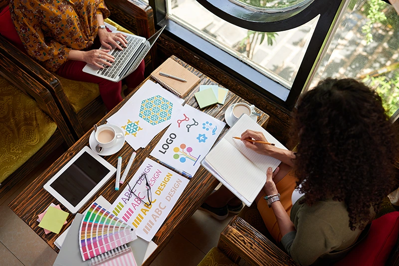
In the fast-evolving world of digital design, staying ahead of the curve is crucial for small business owners aiming to make their online presence shine. The digital landscape is constantly shifting, and what was in vogue last year might already be passé. As we navigate through 2024, several web design trends have emerged, promising to make websites not just more visually appealing but also more user-friendly. This post will explore these essential trends and offer practical advice on how you can apply them to refresh your website, ensuring it stands out while providing an exceptional user experience.
Embrace Minimalism
The saying “less is more” has never been truer in web design. Minimalism is all about stripping down your design to its fundamental features, resulting in a clean, uncluttered website that emphasizes content. This approach not only makes your site look modern and sophisticated but also improves loading times and helps users find what they need without hassle. To achieve a minimalist design, focus on using a simple color palette, ample white space, and a clear hierarchy of information.
Responsive Design is Non-Negotiable
With more people accessing the web from mobile devices than ever before, having a responsive website is no longer optional; it’s a necessity. Responsive design ensures that your site looks great and functions flawlessly on all devices, from desktops to smartphones. This not only enhances the user experience but also positively impacts your site’s search engine ranking. Make sure your web design automatically adjusts to fit the screen size and resolution of the device it’s being viewed on.
Prioritize Accessibility
Making your website accessible to everyone, including people with disabilities, is not only a matter of inclusivity but also a legal requirement in many jurisdictions. Accessible web design ensures that all users can navigate, understand, and interact with your site. This includes using alt tags for images, ensuring your site is navigable with a keyboard, and choosing color contrasts that are easy on the eyes. By prioritizing accessibility, you’re not only expanding your audience but also improving your site’s usability for everyone.
Get Creative with Scrolling
Parallax scrolling, horizontal scrolling, and innovative scrolling animations are breathing new life into the way users experience web content. These techniques can create a dynamic, engaging user experience that encourages visitors to stay longer and explore more of your site. However, it’s important to use these features sparingly and ensure they don’t hinder your site’s usability or performance.
Integrate Multimedia Elements Wisely
The integration of multimedia elements like photography, video, and audio can transform a static webpage into a dynamic, interactive experience. High-quality, original images and videos can convey your brand’s message more powerfully than text alone. However, it’s crucial to optimize these elements for fast loading times and ensure they are accessible. For instance, include subtitles for videos and descriptive text for images to enhance accessibility.
Embrace Bold Typography
Typography is a powerful tool that can significantly impact your website’s look and feel. Bold, creative typography can catch the eye, convey your brand’s personality, and emphasize important content. Experiment with different font styles, sizes, and arrangements to find a unique typographic style that enhances your site’s aesthetic and readability.
Implement Dynamic and Interactive Elements
Interactive elements like micro-interactions, hover effects, and dynamic loading animations can greatly enhance the user experience by making your website more engaging and intuitive. These small details can delight visitors and provide feedback on their actions, making the navigation experience more satisfying and memorable.
Conclusion
The digital landscape is always in motion, with new trends and technologies shaping how we create and interact with websites. For small business owners, staying abreast of these trends is not just about keeping your website modern; it’s about offering a seamless, engaging user experience that reflects your brand’s values and meets your audience’s needs. From embracing minimalism and responsive design to prioritizing accessibility and integrating dynamic elements, the opportunities to elevate your online presence are vast.
However, understanding and implementing these trends can be a daunting task, especially when balancing the day-to-day demands of running a business. This is where professional web design services come in.
Note to Readers:
Foxygraphy, specialize in crafting bespoke web design solutions that blend the latest trends with timeless design principles. Whether you’re looking to refresh your existing website or build a new online presence from the ground up, I am here to guide you through every step of the process. My focus on responsive design, user experience, and brand alignment ensures that your website not only looks great but also performs exceptionally on every device.
I understand that your website is a pivotal part of your business’s digital strategy. That’s why I offer tailored web design services to meet the unique needs of small business owners. From conceptualization to launch and beyond, I work closely with you to create a website that captivates your audience, conveys your message, and drives your business forward.
Interested in making your website stand out in the crowded digital landscape. Contact me today to discover how my web design services can transform your online presence and help your business thrive.
Blog Posts


Related Posts

Enhancing Your Digital Footprint: The Critical Role of Website Maintenance and Security
[dsm_dual_heading before_text="Enhancing Your Digital Footprint" middle_text="The Critical Role of Website Maintenance and Security" before_background_color="#FFFFFF" before_margin="0px||||false|false" before_padding="18px|5px|18px|5px|false|false"...

Brand Consistency Across Media: Essential Tools & Tips for Unmistakable Identity
[dsm_dual_heading before_text="Brand Consistency Across Media" middle_text="Essential Tools & Expert Tips for Unmistakable Identity" before_background_color="#FFFFFF" before_margin="0px||||false|false" before_padding="18px|5px|18px|5px|false|false"...

Systeme.io Review: The Ultimate All-in-One Marketing Solution.
[dsm_dual_heading before_text="Systeme.io Review:" middle_text="The Ultimate All-in-One Marketing Solution" before_background_color="#FFFFFF" before_margin="0px||||false|false" before_padding="18px|5px|18px|5px|false|false" middle_padding="|5px||5px|false|true"...